UX Design | Information Architecture
I've been putting words on websites since 1998. My career started in outdoor and tech content, then moved into deeper structural work. These days, I split my time between content design and strategy, information architecture, UX, and the end-to-end systems that hold it all together.
Building voice, style, and libraries is where I do my best work. The kind that creates consistent, scalable content without reinventing the wheel every time. Because content may still be king, but information architecture is the crown that keeps it from falling off.
AI has become one of my sharpest tools in that process, speeding up drafts, creating templates, stress-testing structure, and freeing up more time for strategic thinking and future planning.
Have a project in mind? Let's talk all things content.
The Problem
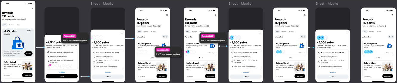
PayPal's rewards program had real value, but it was buried under a confusing structure. Users couldn't tell what points were worth or how to earn them.
My Role
I worked across varied teams like product, marketing, legal, and design to establish UX, visual design, and voice. From redemption flows and progress states to onboarding and partner offers, everything was on the table.
The Solution
Made progress visible and replaced a vague points balance to make tracking easier.
Gave points real meaning. Redemption values were written in plain language instead of loyalty jargon.
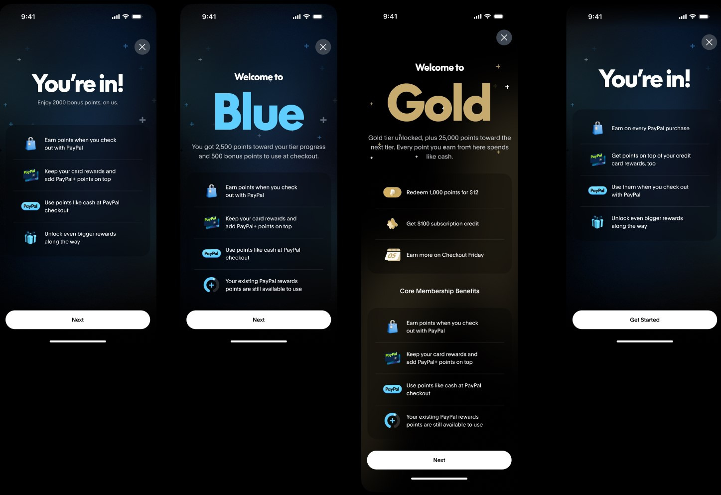
Made tiers feel like status. Each tier got distinct visuals and copy. When the user leveled up, it felt earned.
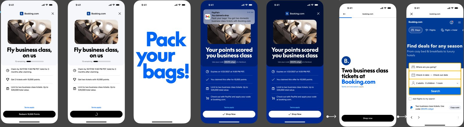
Turned offers into moments. Offers have playful, escalating copy to make redeemed offers feel like a discovery, not an ad.
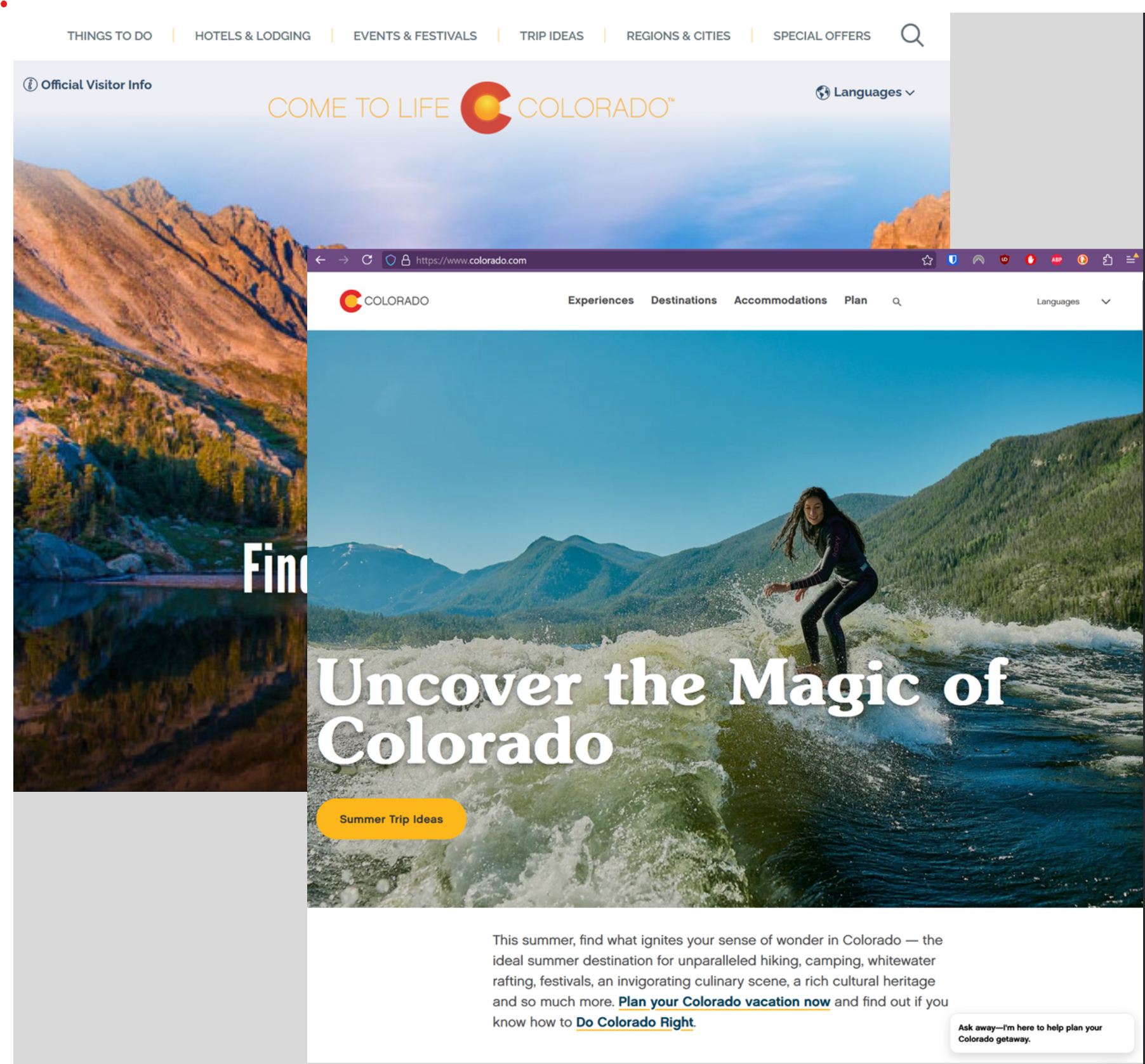
The Problem Colorado.com's navigation had six top-level categories with content buried in deep nesting. The most useful, most popular pages were hard to find, especially for first-time visitors trying to plan a trip.
My Role
I redesigned the information architecture, restructuring navigation from a feature-based menu into an intent-based one.
The Solution
Simplified six categories into four. Navigation now maps to how people actually think about planning a trip: Experiences, Destinations, Accommodations, Plan, instead of a flat list of content types.
Surfaced buried content. Popular pages that were previously several clicks deep are now reachable in one or two steps.
Impact
Vastly reduced clicks to key pages, surfaced previously buried content, and created a simpler path for new visitors.
Rescuing content, simplifying navigation
Unifying .ORG's voice and mission, once and for all
The Problem
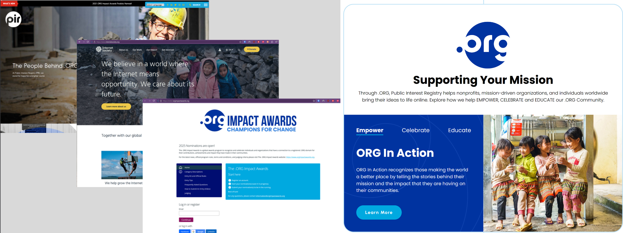
PIR (the nonprofit behind .ORG domains) was spread across three disconnected microsites. Each told a piece of the story, but none of them told the whole one. Users couldn't tell what PIR did, who it served, or how .ORG connected to the organization's broader mission.
My Role
Unified the many services that PIR does into one cohesive site. Then crafted the information architecture and message strategy for a global nonprofit.
The Solution
Consolidated three sites into one. Merged PIR, Internet Society, and .ORG Impact Awards content into a single, coherent web presence.
Built a clear content architecture: Empower / Celebrate / Educate. This structure gave all content a clear home and a clear reason for being there. Instead of three fragmented identities, visitors now get a single, consistent understanding of who PIR is and why .ORG matters.
Impact
Replaced a fractured, three-site identity with one unified nonprofit presence clearer for users, and easier to maintain and scale.
Brands I've Worked With
